Touchstone Climbing is an indoor rock gym with locations throughout California. They view themselves as the top of the line when it comes to indoor climbing gyms and they are proud to offer members the best in services and facilities. Unlike most of the highest rated gyms though, Touchstone does not offer a mobile app.
Team: Stephanie Pritchard, Amanda Kozak, Jason Berger
Role: Research, UX and UI Design, Prototyping
Timeframe: 2 weeks
Tools: Axure, Adobe Illustrator, Adobe Photoshop, Adobe After Effects, Invision
Objective: Design an app that solves the major pain points members of Touchstone face in their dealings with the gym, solidifying Touchstone's place at the forefront of indoor climbing gyms.


DISCOVER
Contextual Analysis and User Interviews
To begin, our team visited Cliff of Id, one of Touchstone Climbing's three Southern California locations. Our aim was to discover what it meant to be a member at a gym that saw itself as one of, if not the best in the industry. We observed, we interviewed members and staff, and we did a bit of climbing ourselves.
Our Findings:
Touchstone is basically the Equinox of climbing gyms.
Members love the gym for it's good service and extensive offerings.
Members love to climb for the sport's blend of problem solving, fitness and friendship.
Gym classes (like yoga) are a draw for many members.
Pain points include, but are not limited to: unmanageable crowd levels, unpredictable route resetting and the required card-swipe checkin system.

CONTEXTUAL INQUIRY

User Survey and Competitive + Comparative Analysis
In order to ensure that we considered all major requirements for the app, we asked members of our target audience to complete a series of questions testing our early findings and measuring the importance of desired features. Questions were open ended and focused on preferences, attitudes and gym experiences.
We then conducted a review of competitors. As there is presently no rock climbing gym specific app, our review was broad, including other gym and fitness apps, general rock climbing apps and the Touchstone website.

GYM CLIMBER FRUSTRATIONS
COMPETATIVE AND COMPARATIVE ANALYSIS
From the discovery phase, we concluded that features for reporting crowd levels, notifications of gym updates and a streamlined checkin process would both give our app competitive advantage in the marketplace and solve our users' biggest frustrations.
DEFINE
User Persona and the Customer Journey
In order to consolidate our findings and define the intended improvements from our user's current experience we created a persona and analyzed her journey at an indoor gym.
CUSTOMER JOURNEY
USER PERSONA
Our Findings:
We will solve our user's main pain points if we can help them answer two questions:
"Is the gym too crowded to climb the routes I want to climb?"
"Will the route that I want to complete be removed soon?"
User Flow
To simplify our user flow, we synthesized our user's two questions into one:
IS NOW A GOOD TIME TO GO TO THE GYM?
TOUCHSTONE APP USER FLOW
In the define phase, we narrowed down our MVP features and established the main goals of our app.
DESIGN
Design Studio
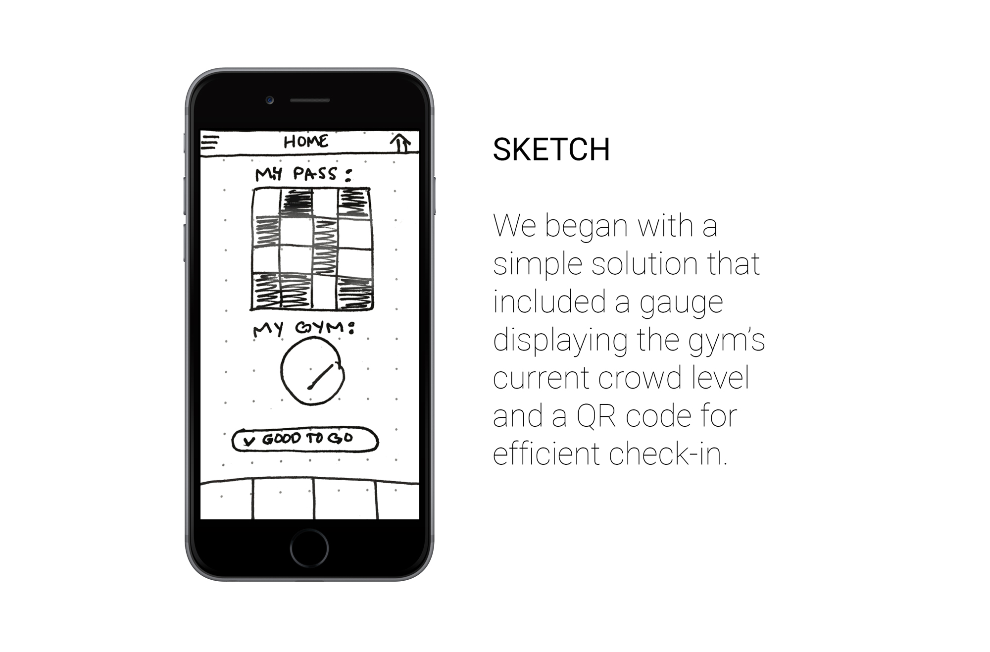
To begin ideation, we implemented a design studio, through which, we created the following feature solutions:

A scannable code on the home screen allows users to efficiently check into the gym without a swipe card.

A route index with change notifications warns users when routes they've favorited will soon be removed.

A gauge based on an algorithm of both gym and user input shows users the gym's current crowd level.
Card Sorting
With card sorting, we divided our navigation structure into a main navigation tab bar (categories relevant to users at specific gym locations) and a home page drawer menu (categories relevant to all Touchstone gyms).

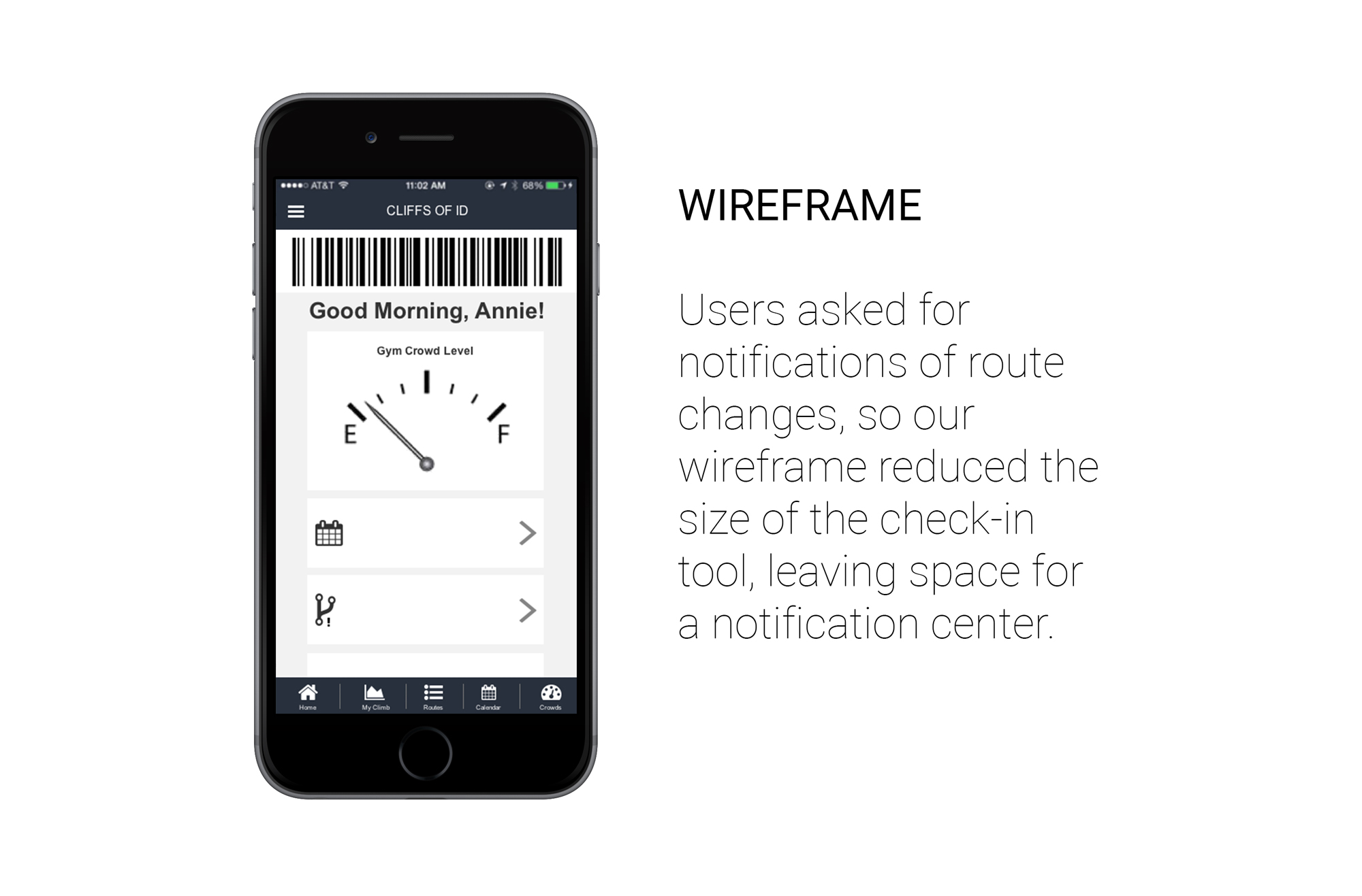
Wireframing
In order to user test our design concepts, we converted our initial sketches into wireframes.

A barcode, rather than a QR code, allowed space for notifications of calendar events and route changes on the home page.

A fifth tab was added to the bottom navigation, allowing easy access to the home page from any page.

Users were given an easy to use button to input their own report of crowd levels into the gauge's existing algorithm.
In the design phase, collaboration was key. Using the entirety of our group's creative mind, we developed designs we could be confident met the goals of both our users and the gym.
REDESIGN
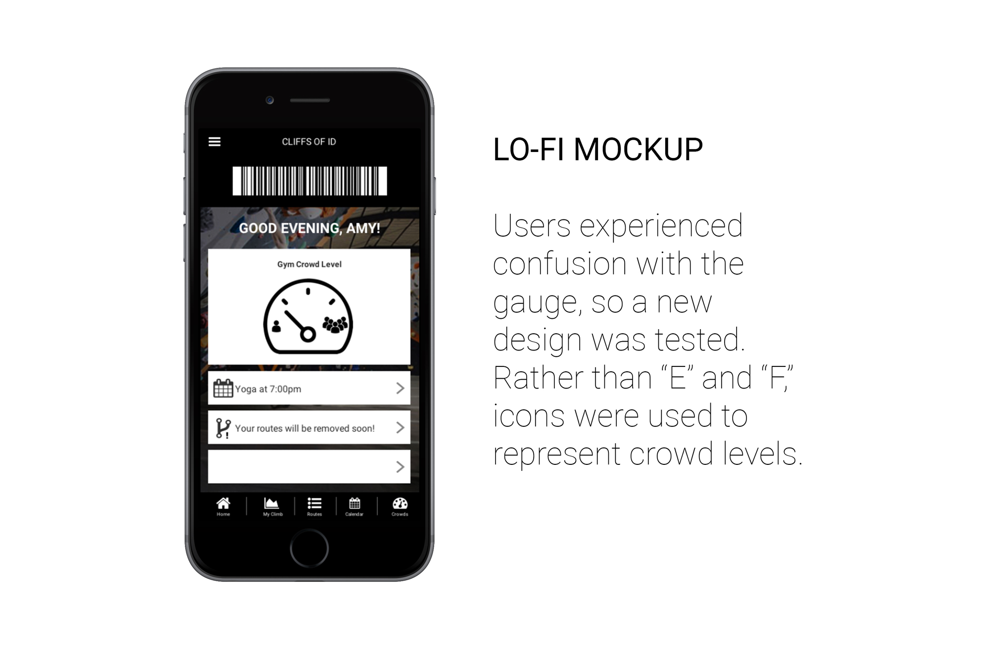
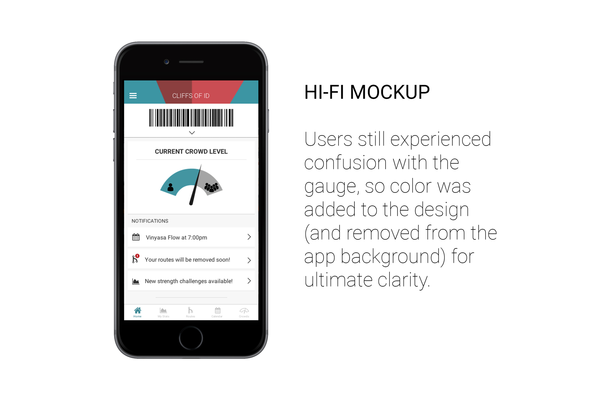
User Testing and Design Reiteration
Although user testing did ensure that our designs met the goals defined, it illuminated several areas for improvement in both clarity and utility. The most significant example of our feedback-reiteration loop can be seen in the evolution of the homepage.